Today I saw a submission on HN about formspree.com which allows you to setup a form on your site similar to google forms / wufoo but without an iframe, so you can tweak it as much as you like. A quick whois lookup shows that this domain was created on 17 Feb 2014 which is just a few days ago. I had launched a similar service called http://getsimpleform.com/ almost 2 years ago. It differs with formspree in a few aspects though. When I was thinking about creating simpleform, I didn’t want to expose the users email to the public by putting it in a form as formspree does, it is just a design choice I made. getsimpleform also has spam prevention using akismet and allows you to create forms with file uploads. So, it is a bit more feature rich then formspree.
However, the point I am trying to make here is about the impact of a good looking visual design on how users perceive your product. Formspree has 209 upvotes (at the time of this post) and getsimpleform.com posts (5 submissions all of which were made by me) have a sum of 7 upvotes. Look at the difference in their screenshots.

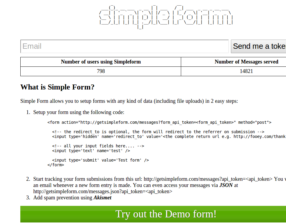
I had made the design simple just to convey the ‘Simple’ theme, but it seems to have backfired on the impression it makes on users. I will spend time and make the interface a bit more shiny. I hadn’t expected the HN crowd to go by appearances. Good to learn new lessons.
My best wishes to the formspree folks